Designing for the user is both an art and a science. At KEEN, we want to create experiences that are not only visually appealing, but also easy to use and understand. Luckily, there are some laws of design that can make the task a little less daunting. Let’s explore three of them: Miller’s Law, Jakob’s Law, and the Aesthetic-Usability Effect.
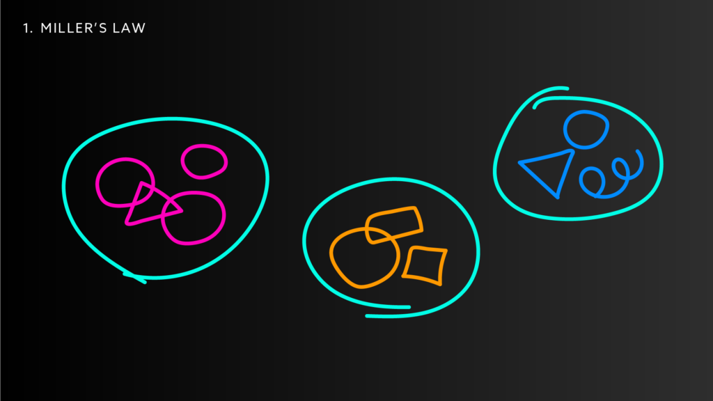
Miller’s Law
This law is thanks to psychologist George Miller. In his 1956 paper, “The Magical Number Seven, Plus or Minus Two: Some Limits on Our Capacity for Processing Information“, Miller’s research showed that people could remember around 7 digits, letters, or words in a row, but that this capacity could be expanded by “chunking” (aka grouping) the information into larger units (as long as the groups made sense). You can see this play out in familiar things like a phone number; it’s easier to remember a number when it’s divided into chunks with dashes instead of just a long string of back-to-back numbers.
This law is key to planning content and creating hierarchy in a design. For instance, instead of having every single page in a website listed in a long menu, we can group pages into a smaller list of sections.
Key Takeaway
Our working memory can generally only handle seven pieces of information at a time (give or take two). Related information should be grouped into manageable chunks so users can easily understand and memorize what they are seeing.
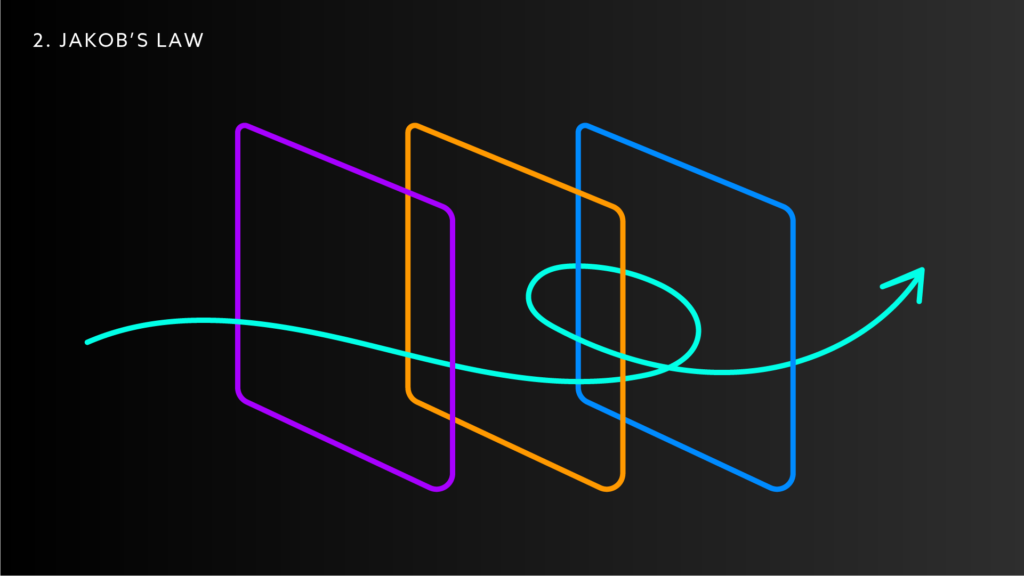
Jakob’s Law
Users spend most of their time on other websites — not on your site. This means that they will expect it to work like most of the other websites they have experienced. For instance, they’ll expect that clicking the logo will take them back to the homepage.
This law was coined by UX Designer, researcher, and author of “Designing Web Usability” Jakob Nielsen. Although it was originally focused on web usability, this law can be applied to many other areas of design. This might involve using standard symbols or labeling conventions, designing products with consistent layouts or workflows, or using established color schemes or typography. When we’re designing here at KEEN, we work hard to create designs that feel unique and customized to our clients, while also making sure key functionality aspects conform to design patterns their users will be familiar with.
Key Takeaway
As much as you might want to be unique and different, the reality is that sticking to familiar design conventions and structures might be the best approach for your users.
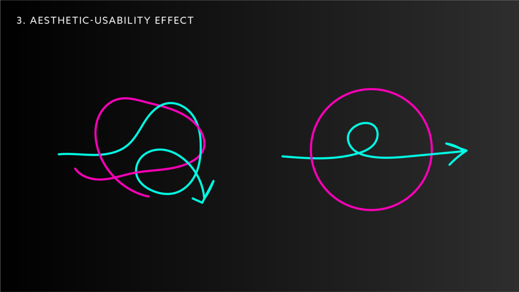
Aesthetic-Usability Effect
In the mid 90’s, researchers Masaaki Kurosu and Kaori Kashimura from the Hitachi Design Center found that aesthetically pleasing designs are also perceived as more usable. People feel a positive response when they see something beautifully designed, and it improves their perception of how usable it is, even if it has functionality problems…
When designs are aesthetically pleasing, people are more willing to tolerate minor usability issues. You read that right — beauty might make people blind to issues (which, honestly, also explains a lot of relationships…). While designers should take advantage of the grace users have for beautiful design, we should also pay attention to if it’s masking usability issues. Are users struggling to find key information?
Key Takeaway
Design should be aesthetically pleasing as it will improve a user’s experience, but it needs to be functional at its core for long-term success. Visual appearance and functionally — form and function — need to go hand-in-hand.