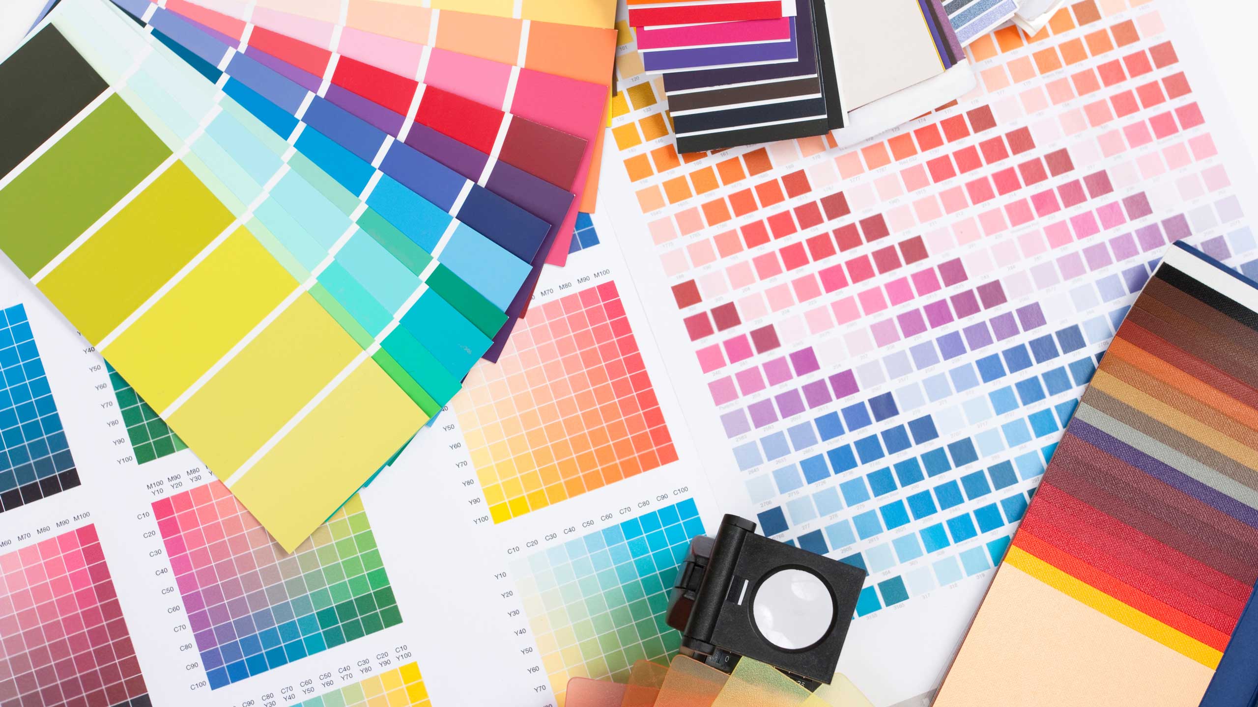
Choosing a typeface is one of the most challenging steps of any design. After all, there are hundreds of thousands of typefaces worldwide, with new ones cropping up every day. So how could you possibly choose with so many options?
Using appropriate typefaces is key to communicating a desired mood and emotion, while combining different font styles is essential for establishing a visual hierarchy in a design. Understanding type—styles, anatomy, pairing—is important for making informed type decisions and will help make these choices a breeze!
Let’s start with looking at basic type styles.
Typeface vs. Font
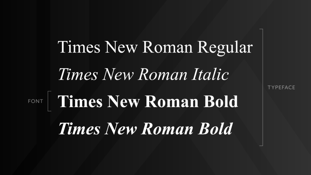
Yes, there is a difference! These terms tend to be used interchangeably by the general public—even we KEENers are guilty of it—but most snobs designers will jump at the chance to educate you on the difference between the two.
Simply put, a typeface is a collection of fonts that share the same visual characteristics, such as serifs, height, letter spacing, and other unique stylistic attributes. A font, on the other hand, refers to specific variations of the typeface, like italics or bold.
Many people say “font” when they mean “typeface.” For example, Times New Roman is a typeface. Times New Roman Bold is a font.
Typefaces create a specific mood when used in graphic and web design. The characteristics of the constituent parts of a typeface give them character and style.
Feeling like a type expert yet? Let’s dig a little deeper.
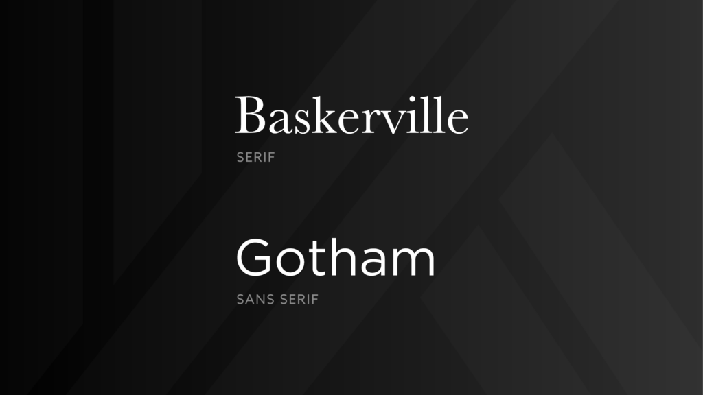
Serif vs. Sans Serif
The small lines on the ends of many letterforms easily identify serif typefaces. Serifs originated from the Latin alphabet when the Romans carved inscriptional lettering into stone. Serifs generally create a mood of richness with classical styles often used in large bodies of copy due to their varying line weight; however, bold or slab serifs can create a more robust tone well suited for headings.
Sans serif, meaning without serif, lacks the small projecting lines at the end of strokes. Sans serif typefaces tend to have less line width variation than their counterpart and as a result, generally work well in large applications. Sans serif typefaces offer a wide variety of widths and weights, giving them a more friendly or severe tone. While clean and modern-looking, some sans serif fonts may not have the same readability for body copy that sans serif fonts do.
Examples of serif typefaces include Times New Roman, Garamond, and Baskerville. Examples of serif typefaces are Arial, Helvetica, and Gotham.
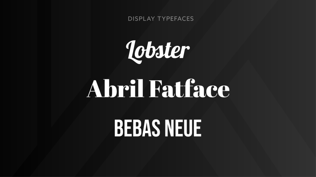
Display
Display typefaces are loosely defined, often decorative and with more stylistic variation than other typefaces. As a result, they are more practical when used for short headings in large sizes. However, avoiding display typefaces for body copy is strongly recommended, as they lack the structure and uniformity required to ensure legibility.
Though display typefaces are often unconventional, they still have an important place in the design world. This is because these typefaces excel at setting a design’s mood or feeling.
Handwritten and script typefaces are often considered display typefaces. Certain serif and sans serif typefaces can be considered display as well. Examples of display typefaces include Lobster, Bebas Neue, and Abril Fatface.
Conclusion
There’s much to learn about type, but remembering these basic styles should help make your type decisions easier. Experiment with mixing different type styles to find the perfect combination for your next project!
–
At KEEN Creative, we value the importance of strong brand design. Don’t hesitate to reach out for help when needed. Part of our process is educating our clients on the importance of maintaining a consistent and effective brand image. Our team of experts will be happy to assist you in keeping your brand looking its best.